I love neon signs. I love how the bright colours cut through the night and transform any scene into a vibrant and compelling space. This is handy because, more often than not, the location of a neon sign will be in some of the most mundane places known to man. Especially if the sign is from a pre-21st century vintage. Think boring Suburbia, a carpark, perhaps a takeaway joint with questionable food hygiene standards.
The creative designs, full of colour and excitement, are so satisfying as if made to directly appeal to the child in us.

I yearn for the kinds of signs you see in the US. Those classic and glamorous Americana icons like the Holiday Inn Great sign. Kind of the grandaddy of signage.
It wasn't until I was out and about photographing locations for the Hotel Motel 101 collection that I even realised what fantastic subject matter they might make.
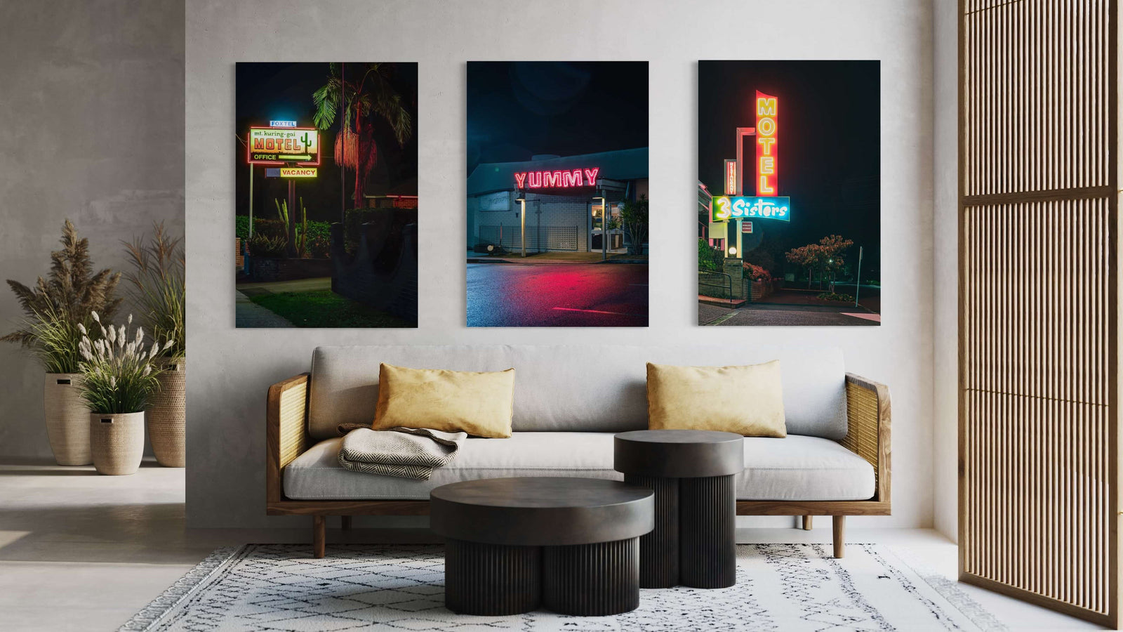
The first that I came across was the motel sign for the Mt Kuring Gai Motel. Such a beautiful mix of colours and a pleasant western/desert theme, even though the motel's location is a humid subtropical climate surrounded by dense bushland.
The second was the 3 Sisters Motel in Katoomba.
Blue and red mixing to give purple hues in the night and a design that might just compete with some of those classic American roadside signs I mentioned earlier.
Abandoned buildings have always been the main focus of Lost Collective. I've always been on the lookout for them wherever I go, yet I never thought much about keeping watch for neon until a few weeks ago when I realised how much I really love a good neon sign.
When a friend alerted me to the sign at Yummy Seafood Restaurant in Greenacre, I knew immediately that I needed a photo of it.
One rainy night, I decided that would be a perfect opportunity to get out and take a photo.
I knew the wet bitumen would have a lovely pinkish hue from the sign above.
A nearby floodlight helped flare some rain droplets on the lens, and voila, one of my favourite photos was created.

I love this one so much that I will be getting my own glass print for my wall.
One lucky customer has already beaten me to the punch and picked up the #1 of 25 editions of this print to be made.
I have to say, though, I think combining the 3 Sisters Motel Sign, the Mt Kuring-Gai Sign, and the Yummy as a set work perfectly.
It wouldn't be right to just have the one when the synergy is so incredible, so a set of three it is.

Interested in some for yourself? Check out the product links below.

Leave a comment (all fields required)